
YIP Hauz Cafe.
YIP Hauz Cafe is an authentic local cafe in Bandung, Indonesia. A responsive website was prepared for online presence and boosted their online business. This responsive website aims to give users direct online orders with businesses instead of 3rd party delivery companies. Key features include a home page, direct online orders with a smooth payment process, a menu with detailed information and pictures, and a credible reviews section.
Role : UX Designer
Client : YIP Hauz Cafe Owner
Tools : Figma, PSD, AI, Google Sheet, Google Docs
Project Timeline : 80 hours
If time is limited, check out the 1 minute summary below.
SUMMARY
Why: Is it a problem worth solving, can it be solved, and is there a market for it?
YIP Hauz Cafe was founded in 2016 with a mission to introduce unique local taste gelato at an affordable price. They sell different food and snacks with a focus on their amazing gelato. They do not have a website and have been using Instagram to showcase and reach out to the market. Gofood and Grabfood are used as their delivery platforms. With the limited functionality of the social media platform, they could not organize reservations, events, or online orders automatically and had to do those via direct messages. As a growing business, online orders, reservation booking systems, and an e-commerce storefront would help them expand their business. The addressable market is broad, and users demand online food orders to be easily used yet affordable.
How: build, measure, learn.
Talking to the cafe owner to gain insights into their goals and understand their pain points. Their primary problem is that the online order through 3rd party costs them less profit. They hope they can reduce this cost by having direct online orders from their own website.
Using primary and secondary research, I identified critical problems and created a responsive website that (1) made direct online orders easy for users with a smooth payment process and (2) showed credible reviews in one section to gain online trust in the market.
After a discussion with the stakeholder, we prioritized the MVP for the home screen, online order, menu page with details, pictures, prices, payment process, and review section based on the project timeline.
I sketched a few possible solutions for IA based on what is familiar and most effective from competitor sites. Moderated usability testing via Zoom was conducted, giving valuable insights into some details I missed.
Results
After the creation of the responsive website, I observed improvements in the following:
The average time of online orders via the website with an easy payment process
Greater number of potential users
Ability to check credible reviews from the website
Clear view of updated promotions and upcoming events
Clear address that connected to Google Maps with shop opening hours
Key learning points.
There were many metrics we could consider during the development - online order flows, various payment methods, account registrations, reviews on the website, etc.
As this project has time limitations, the main learnings were that I did user research diligently and found various valid data. I learned how to use collected data properly and apply them to ideation with the best UI result.
The areas I need to work on are controlling my calm with overload research findings and trying to prioritize essential points without being too idealist. I also learned to be open and flexible to the outcomes without bias.
Do you want to read the full story ? Keep scrolling, 10 minutes read.
Let’s do this!

Background
YIP Hauz Cafe was founded in 2016 with a mission to introduce unique local taste gelato at an affordable price. They sell different food and snacks but focus on their amazing gelato.
Problem
The business has no website and has been using Instagram to showcase and reach the market. Gofood and Grabfood are used as their delivery platforms. With the limited functionality of the social media platform, they could not organize reservations, events, or online orders automatically and had to do those via direct messages.
Approach
I designed a responsive website containing an online order, reservation booking system, various payment options, and an e-commerce storefront. Customers can view the menu and order directly from the YIP Hauz website instead of the third delivery parties for a direct and more affordable price. They can learn more about the cafe's vibe, book reservations online, book catering/events and view authentic reviews from other customers. It is also a platform to engage better with customers through particular advertising and promotion.
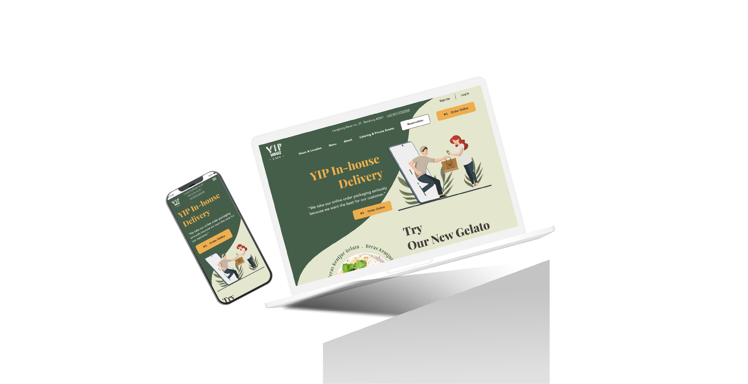
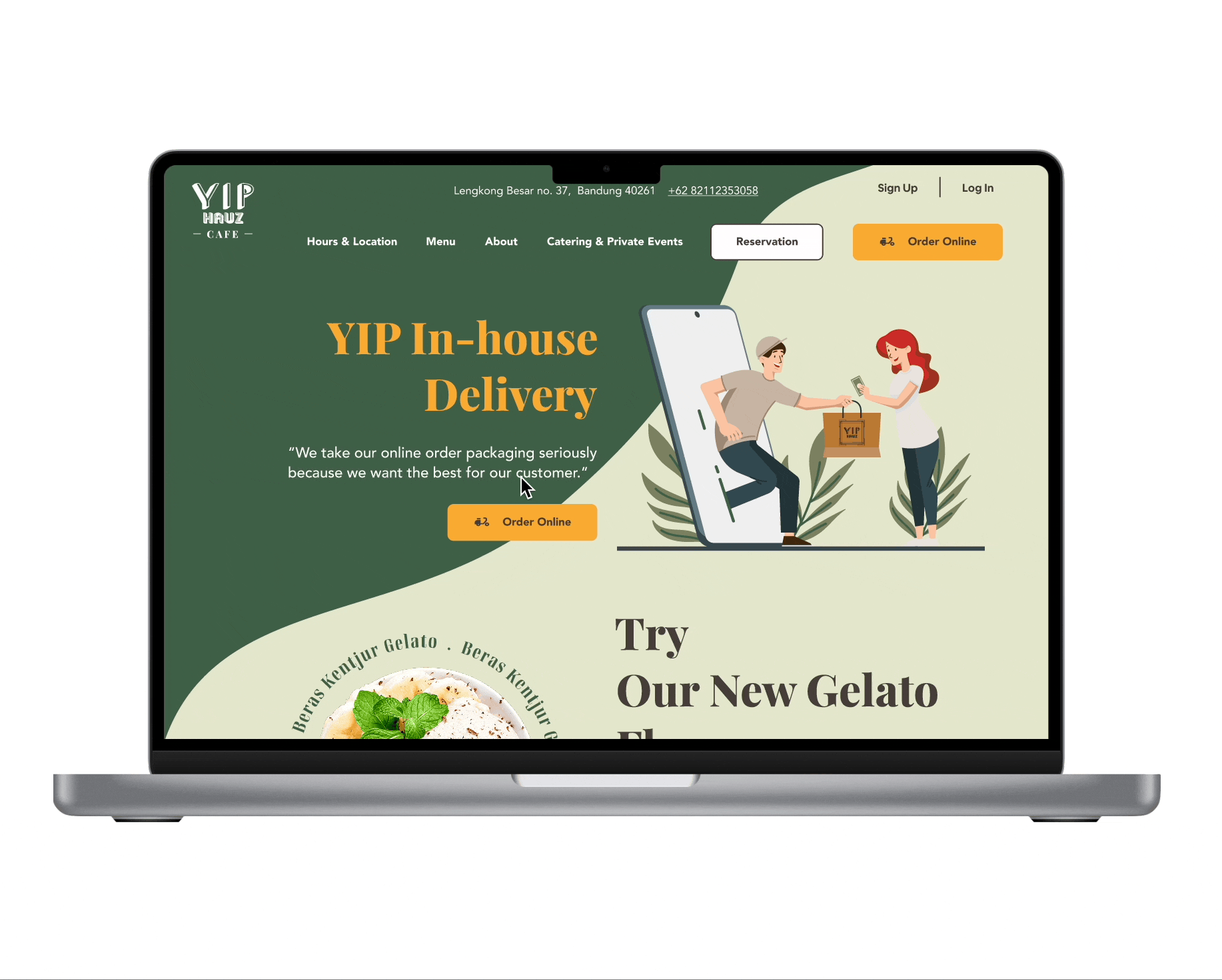
Preview of Features
The prototype was based on Macbook Pro 14”

Problem: YIP has no website with general and detailed information, pictures, menu, online order, and reservation booking.
Solution: A responsive website with all information available online.
Problem: YIP collaborates with 3rd party delivery companies but has no in-house order online service.
Solution: An in-house order online feature on the website.
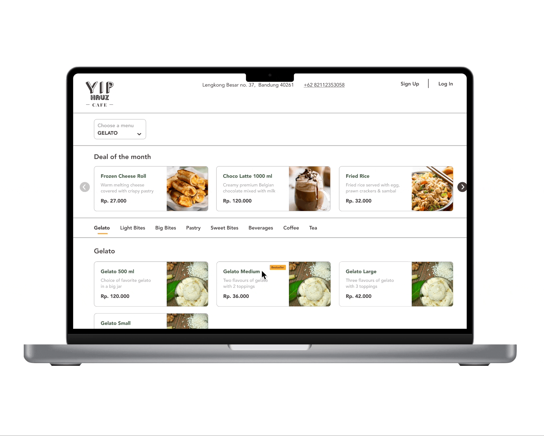
Problem: YIP has no pictures of the menu items online.
Solution: Create an online order menu with pictures, details, and prices. I added bestsellers and popular tags for extra information.

Problem: There is no online checkout for in-house orders.
Solution: Created a smooth checkout flow with various payment options.
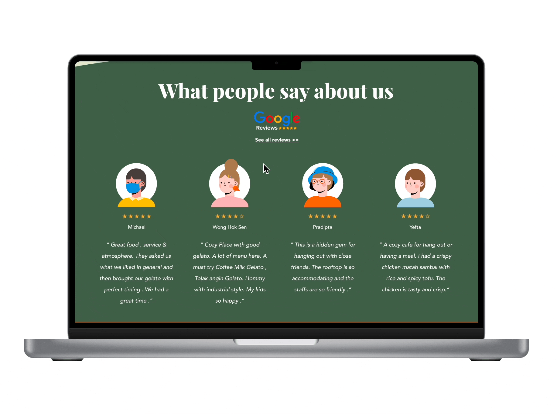
Problem: YIP has credible reviews online only on Google Maps reviews.
Solution: A review section that links to the source. ( Google Map reviews )
List of Contents.
1. Research
2. Define
3. Ideate
4. Prototype & Test
5. Reflections
1. RESEARCH
Indonesia's F&B (Food and Beverage) market is challenging and competitive, but it has enormous potential. Hence it is vital to understand the target market and use the best approach to thrive.

I checked Google reviews of some feedback from customers. YIP has excellent feedback online, even without a website, so I believe that YIP can grow tremendously if they have a digital platform to reach a broader market.

Competitive Analysis
Competitors were chosen based on similarities between the target market and the business presence of local cafes in Bandung. I saw that some cafes have weaknesses, such as their websites are not user-friendly, not responsive, and not connected to social media. They have difficulty knowing promotions or contacting the business if they have inquiries. This helped me identify their patterns and to see opportunities for the YIP website.

The main findings from my competitive analysis include the following:
Not every competitor has a website.
But if they do, they have basic information: Menu, About, Location, and Hours of Operation.
Every competitor engaged with 3rd party online delivery companies or used Whatsapp for online orders.
Every competitor has an Instagram account with attractive pictures.
Some competitors sell a variety of food and drinks apart from dessert and gelato.
Most of the competitors have a cheerful brand image.
“After secondary research, I see opportunities for YIP website but to have more clarity I need to understand the needs of the market and the goal from stakeholder.”
Stakeholder Chat.
To understand the problem and find the best solution, I called the YIP Hauz Cafe owner before I did the User Interview. Click here for more details. Some essential points are:

User Interviews
I conducted Interviews to empathize with customers regarding online food orders. I was able to complete a successful Zoom interview with this interview guide involving 6 participants around 25-43 years from Bandung, Indonesia, with four males and two females. The following are my findings uncovering their motivations, wants, and needs.

“ How might I help customers to check and order food online on the YIP Hauz Cafe website at ease?”
2. DEFINE
Affinity Map
I created an affinity map to acknowledge and target the participants' goals, motivations, needs, and pains. I understand that the needs of everyone can be different. Taking notes and digging more profound during the interview gave me valuable insight into essential points for local market users. Some participants loved online orders after Covid-19 happened, while some still preferred to enjoy the food with the cafe's ambiance in person. But the market is moving toward online orders because YIP cafe owner said that their business has decreased tremendously since the pandemic. Below I gathered valuable insights from the interviews and clarified their expectations for the YIP website.

Persona
After reviewing and summarizing the interview results, I created a persona to guide me, relate to what the user thinks and feels, and help me make the Site Map and User Flow for the website. Focusing on online food orders and payment processes for this project, I created Mawar as a relatable persona. Mawar is a professional who works in a big city and loves to eat and try new food with friends. She also enjoys the convenience of ordering food and drinks online.

Project Goals
I created a Project Goals Map of the business, user, and technical sides. This gave me a clear idea of what to focus on on the YIP Cafe website at a high level.

“I imagine the flow to order food online from a cafe website and what options and possibilities can be made. Not forgetting to consider the user flow from online delivery app as well.”
3. IDEATE
Site Map
After understanding the Project Goals, I could start to map out what pages and features are necessary. I did some sketches while referring to various F&B websites around. However, I focused on what is essential to create for YIP for now. It should be a solid base to develop further later on. I made the main home page focusing on online orders. Still, because I received some insights from the Interviews about promotion, menu, reservation, address and opening hour, and customer reviews, I considered those and placed them all on the home page.

User Flow
I imagined myself as Mawar ordering food online via the YIP Hauz Website. I made different flows, but some of them were not that simple and I believe the most effective and straightforward way is the best approach, especially for hungry users ;) Instagram in Indonesia has huge users, so starting the flow from social media makes sense here because it lures potential customers to the YIP website.

Low-fi Wireframes
While referring to the site map, I sketched some wireframes. I made two options for the home page because I like both layouts, but I made some changes here and there after getting feedback from people. I tried to make four main screens: the home page was created to be easy to use with online order CTA in the hero section, promotion below it, a gallery for the ambiance of the cafe and review section, a pop-up box for pick-up or delivery to provide options of delivery method and address, delivery menu page with pictures and detail of the menu, and check out page in one page to see in brief how many steps users need to finish the process. The sketches were based on a combination of patterns I observed from the best cafe websites on the internet and Pinterest. One interesting thing is that many websites use the pop-up box as the opening, and later I realized that many users dislike it.

Mid-fi Wireframes
Referencing the sketches and considering possible alternatives, I created a mid-fidelity design. The wireframes included the Home Page, Menu Page, Pop-up Box for Delivery Page, Detail Menu Page, and Checkout Page. I created two home pages and asked for feedback from people. They gave valuable insights, and I realized that the best is to combine both options for a better user experience. I created mobile wireframes and tried to give the same experience with a desktop view. I want to provide precise detail on mobile view while not missing any element.

Moodboard & UI Kit
Next, I created a mood board for design inspiration together with UI Kit. During this phase, I discussed and asked the owner what direction and inspiration they like to have. I consider their request to have a neutral and inviting image with primary green as the main vocal color. Green also conveys stability, endurance, and approachability. I chose the combination of Playfair display and Avenir fonts because they are easy to read, considering some target markets can also be from the older generation.

“How should I build it? A prototype was prepared for the usability test. I wanted to see what goes well and which part needs to be improved.”
4. PROTOTYPE & TEST
Responsive Prototype
I created Hi-Fi Wireframes while remembering the flow, the goal, and the essential points without making them too complicated, clear with fewer clicks, and keeping it simple. I want to promote online ordering as the vocal point, which will boost YIP Hauz business. I made some iterations for the Home page. For the first version, people said it was not attractive, the color was too soft, the color contrast between background and text was not that great, the menu section was quite stale and not inviting, and the review section was a bit vague. After two iterations, I was happy with how it looked and received great feedback. Even though it is a lot of work but I am open to any feedback to improve the User Experience. I believe it is necessary to focus on the user to build the best platform. After some fruitful feedback and numerous iterations, below is the result.

Usability Test
I tried to recruit a wide range of participants within YIP target market to bring various insights into my design iterations. I have recruited 5 participants who align with my provisional persona from both genders. Different participants were chosen than my first interview to gain more insights from different perspectives. I conducted a remote test via Zoom. View Usability Test Planning
The goals for the usability testing:
1. To evaluate how good is the usability rate of the YIP cafe website ( if users can navigate everything smoothly).
2. To understand the potential pain points of users during the task.
3. To see what users think of the website's overall design. Is that attractive and engaging them to order online?
4. Define whether the checkout and payment process are smooth and clear.
Usability Testing Summary
The usability testing and the prototype were successful, with a 100 % completion rate with minimum delay or confusion to finish the tasks. They like the overall design and flow; I have gathered the priority iterations note. Check the full report of User Testing Findings here.

Priority Revisions
After learning the pain points and feedback from users, I made the necessary changes to the prototype.

Home Page - Hero Section
Problem: Users were unaware that more sections were at the bottom of the hero section.
Solution: Make the illustration and sections smaller to show more sections below the hero section.Problem: Users were confused about the illustration, whether the guy takes or gives the food package to the lady
Solution: Remove the back arm of the lady in the illustration to make it evident that the guy is delivering the food package.

Home Page - Body Section
Problem: Users were not attracted to the image and layout of a new gelato flavor.
Solution: Change and add more food pictures on the homepage to boost customers’ confidence to order food from the site and feature bestseller items to increase customers’ appetite.Problem: Users didn’t see the text around the gelato due to the bad color contrast.
Solution: Change the color of the circle text of the gelato picture to be darker for better color contrast.

Home Page - Body Section
Problem: Users missed the free gelato offer because it is not as evident at the bottom.
Solution: Place the offer of free gelato after the hero section for better visibility.

Home Page - Review section
Problem: Users questioned the reliability of featured reviews.
Solution: Add a link to Google Maps Reviews from the reviews section to convince users that the reviews are credible.

Delivery Pop-up Box
Problem: Users missed the note “Fill in the address” because it is at the bottom of the box and is in grey with small text.
Solution: Change the note “Fill in the address” to be on top with prominent color.Problem: Users prefer the “Use my location” button instead of filling in the postal code box.
Solution: Move the “Use my location” button to the left for better usability.Problem: Users were confused and didn’t fill in the postal code but directly jumped to Yiphauz Delivery which was inactive before filling in the postal code.
Solution: Reduce the opacity of the button to avoid confusion.

Menu Page - Detail Section
Problem: Users wanted to know what kind of toppings are available together with images.
Solution: Add images for a better understanding of the topping types.

Menu Page
Problem: Users wanted to know which ones are bestseller items.
Solution: Add a bestseller icon to menu items.
The Final Product
After the iterations, the responsive website project is completed!
5. REFLECTIONS
What I learned
Always ask “WHY” before sketching and designing
Business Knowledge : I learned deeper about the F&B Industry ( Food & Beverages Industry ) and the possibility of utilizing digital technology for customers’ convenience. It is challenging for local businesses to compete with big chains that can afford more expensive apps with massive promotions and offers.
Iterating: I learned to be more open and flexible with feedback and iteration. I should focus on the overall user experience.
Time Management: I realized that sticking with the timeline is essential, but learning to let go and deliver a minimum viable product (MVP) is part of being a UX Designer.
Challenges I faced
I started this YIP Cafe Website project with the full awareness that Bandung, Indonesia, has a different time zone from the US. It created complications with planning interviews and usability tests because I needed to adjust to participants’ and stakeholders' time zone. However, I tried to approach them in advance and followed up with some texts that helped me solve this problem.
When I approached YIP Cafe's owner, they were hesitant to make a website because they were scared of the high cost. However, after some discussion and understanding of their worries, I convinced them to start with the research, and she was excited about the findings. I was surprised that the market demand for in-house online orders was not high because it is cheaper than online food delivery apps.
Understanding that I need to empathize with the client, sometimes it is complex when I have done the UI based on the chosen inspiration from stakeholders, but they changed their mind while I had my deadline to meet. But the moment I realized that is for the best result for stakeholder and users, it was much less stressful, and I could perform better.

Next Steps.
For this project, I focused on the home page, menu page, online order process, and payment process for users.
The next step will be:
Another Usability Testing for the Desktop version after the iteration
Another Usability Testing for the Mobile version
Profile creation for users
Detail features on reservation feature and contacts us feature
Hand in the project to the developer team to run and launch it for the last quarter of 2022