Sanvello App.
The Sanvello iOS app utilizes cognitive behavioral therapy (CBT) and guided meditation principles to support mental health. To meet the needs of modern users who seek overall physical and psychological wellness, a yoga feature has been added. This allows users to practice yoga at their convenience, from the comfort of their own space.
Role : UX Designer
Client : Sanvello
Tools : Figma, PSD, AI, Google Sheet, Google Docs
Project Timeline : 80 hours
If time is limited, check out the 1 minute summary below.
SUMMARY
Why: Is it a problem worth solving, can it be solved, and is there a demand for it?
Sanvello was founded in 2014 based on cognitive behavioral therapy (CBT). It has an online therapy feature, audio lessons, a mood tracker, and journaling tools that help users set goals and analyze their progress. However, they have no physical exercise to corporate into their daily routines. With more than 20.000 mental health apps that exist today, it is essential to satisfy this modern market with an all-around experience. Millennials are so much more technology-adaptable and are more than willing to use the app to record their health journey and practice yoga digitally whenever and wherever.
How: build, measure, learn.
As someone who has had depression in the past, I understand that it is not an easy journey to improve mental health.
Using primary and secondary research, I identified the problem from people who want to utilize mental health apps to guide them to be better and created a feature on the Sanvello app that (1) made yoga easy to do anytime, anywhere, and (2) motivate people to do yoga with peers in their comfort place.
I was not sure what features to add at first, but after the interviews, it was more evident that people were missing something from the Sanvello app and the physical aspect that leads to yoga practice.
Using Sanvello UI patterns and heuristics, I sketched possible solutions for new yoga features.
Outcomes: learnings.
I have encountered a few challenges during the process - various types of yogas to add, recorded and live sessions, duration, reviews on the app, and so on.
However, since the goal of this project was adding a valuable feature to Sanvello app, the main learnings were that I became proficient in understanding the Design System and how important to synchronize icons, elements, and color pallete of the new feature to be allign with the rest of the app.
I was objective in getting the best possible result from collected data and valuable feedback for the next round.
The areas I need to work on are trying to level up my Figma skill to save more time and be more efficient in the project.
Do you want to read the full story ? Keep scrolling, 10 minutes read.
Let’s do this!
Background
Sanvello was founded in 2014 by Dale Beermann and Chris Goettel. It is based on CBT and mindfulness meditation with a mission to combat stress, anxiety, and depression that realistically fits into daily routines. It has audio lessons, a health and mood tracker, relaxation exercises, and journaling tools that help users set goals, challenge negative thinking, and analyze their progress. Not only that, Sanvello has partnered with various health insurance companies to lighten the cost of professional therapists for users.
Problem
Mental health therapy apps are popular because they not only help address the volume of need for mental health support but also make that support more accessible, convenient, and affordable. On top of that, doing physical exercise, especially practicing yoga as a habit, also reduces unmanaged stress, the main component of chronic disorders such as anxiety, depression, obesity, diabetes, and insomnia ( Journal of Alternative and Complementary Medicine (Vol. 13, No. 4)) from Boston University School of Medicine and McLean Hospital. But not everyone has time to go to a yoga studio often, and Sanvello has no physical exercise feature to corporate into daily routines. With this limitation, users feel something is missing in their health improvement journey. With more than 20.000 mental health apps that exist today, it is essential to satisfy this modern market with an all-around experience.
Approach
I designed a new yoga feature for the Sanvello app to fill this gap, allowing users to practice yoga digitally from the comfort of their space and time. Users can choose yoga practice based on their preference, save it for later, the duration they want, the body part to focus on, and even book a live yoga session with their favorite yoga instructor for extra motivation. Now, Sanvello can be an all-around mental health app because it tackles improving both body and mind.
Preview of Features
Problem: Sanvello has no physical feature to improve the psychological aspect of users. Users desire an all-around mental health app to enhance their well-being.
Solution: Adding a yoga feature on the Sanvello app.
Problem: Sanvello has today’s meditation on the home screen but not today’s yoga.
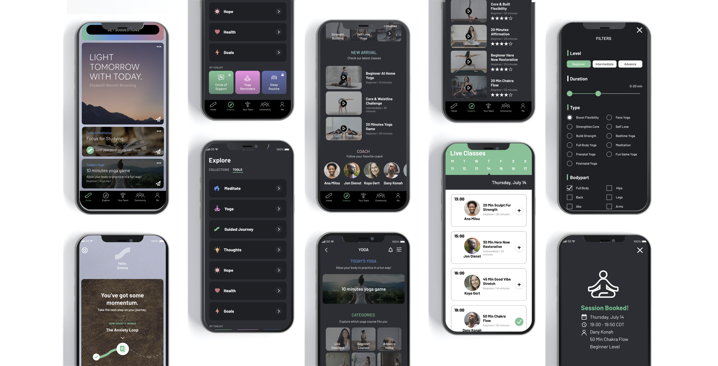
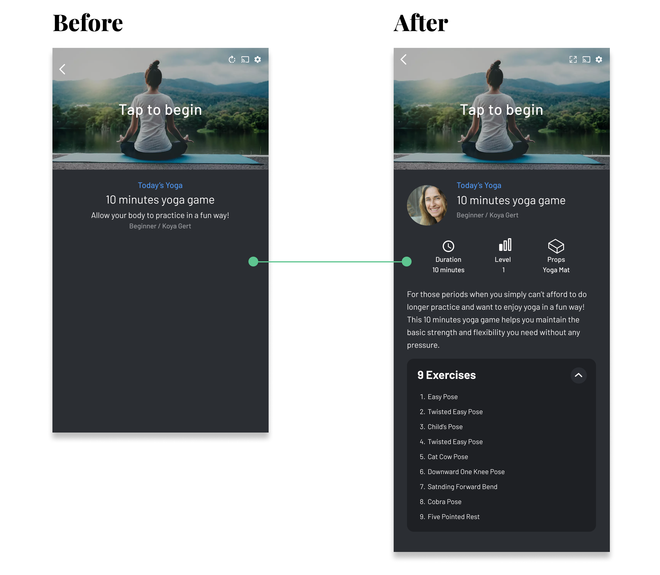
Solution: Today’s yoga is added on the home screen for users’ convenience. The view can be portrait or landscape for a bigger view.
Problem: Users sometimes have no motivation to do yoga by themselves alone.
Solution: Added live yoga sessions with the instructor and other users digitally.
Problem: Users want to choose a yoga session based on their preference.
Solution: A simple yet informative filter is created to narrow down yoga options.
List of Contents.
1. Research
2. Define
3. Ideate
4. Prototype & Test
5. Reflections
1. RESEARCH
Here are some of my key insights from my secondary research to understanding the general trend and market of mental health:
Just from these statistics, it is clear that mental health app such as Sanvello is worth focusing on. Moreover, since the COVID-19 pandemic hit, traditional therapy, which was costly, has been slowly shifted to digital. More therapy apps were already starting to gain popularity amongst people with issues from stress to severe mental illness. However, Sanvello has limitations because they focus more on the mind but do not yet incorporate physical aspects in their app features. Considering all of these, Sanvello needs to implement new features that would engage physical aspects to get better user results.
I have checked mental health reviews on some mental health apps in the market. See below:
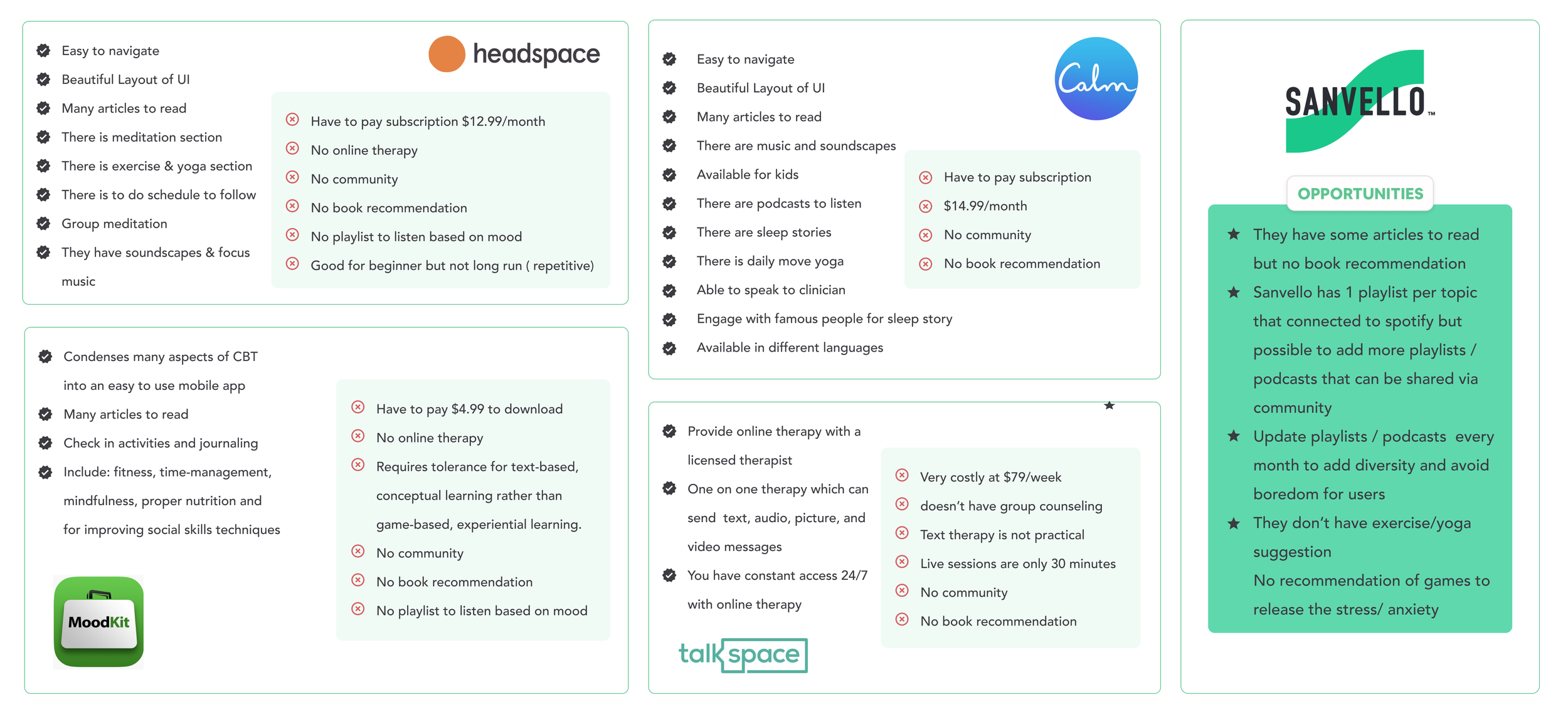
Competitive Analysis
I conducted a competitive analysis to understand the trend in the market, comparing the strengths and weaknesses of other mental health apps and seeing what opportunities can be added as a feature on the Sanvello app.
The main findings from my competitive analysis include the following:
Not every app incorporates physical activities in its program; only Headspace and Calm have done it.
Every app requires an extra charge for premium features.
None of them have a release stress mind game.
None of them have a book recommendation for the user to read.
“After secondary research, I see a few opportunities for Sanvello, but I can not determine what feature to add. I will collect more information from user interviews and let the findings guide me.”
User Interviews
Once I had the competitive research and saw the opportunity in the market. What is missing from Sanvello? I decided to conduct some user interviews to understand better mental health app users' needs and pain points. I did a screening survey to find the target participants, and I conducted a successful interview with 7 participants from 23-44 years old, with one male and six females. Their occupations are human resources, graphic designer, photographer, student, hospitality sales, and teacher. The following are my findings uncovering their motivations, wants, and needs.
All participants have previous experience with mental health apps, and Sanvello is used in their countries. The conclusions of the interviews can be found here.
“What feature to add for Sanvello to help the user improve their mental health?”
2. DEFINE
Affinity Map
Next, I created an affinity map to acknowledge and target the participants' goals, motivations, needs, and pains. At this stage, I grasped the problem and what was missing from Sanvello. It lacks physical aspects to improve mental health. Some participants agreed that they are interested in doing yoga, but since the pandemic, they have been scared to be indoors with other people in public areas. Some said they have no motivation to do yoga alone. So I was thinking, how to help them with these problems?
Persona
With the research conducted thus far and the insight provided by the participants, I came up with a user persona that reflects the different needs and pain points that were brought up earlier. Sienna is a typical busy working individual who cares about her well-being but is busy with work and wants to have easy and practical yoga practice on the go.
Project Goals
After persona, using all the findings I have from research, I created a Project Goals Map of the business, user, and technical sides. This gave me a clear idea of what to focus on when I design yoga features.
“I imagine the flow when users open Sanvello app and what they expect to see on the home screen and where they can find the yoga feature within it.”
3. IDEATE
Information Architecture
With the user-centered problem statement by my side, I could start to map out clearly where is the best location for the new yoga features to be added to the app. I did some sketches based on various yoga apps in the market and corporate it with what made sense to Sanvello. Also, to create the flow as smoothly as possible without disturbing other features.
Site Map
From Site Map, I had an idea of the path the user would take to look through the app and how to find the yoga feature. I created the flow below to see how the new features would be implemented into the existing app. The idea is to make the yoga feature easy to spot from the home screen and give users less cognitive load to choose from when they want an easy on-the-go yoga practice. While users still have flexibility in adjusting their preference with live yoga or specific exercise when they go to the yoga screen.
User Flow
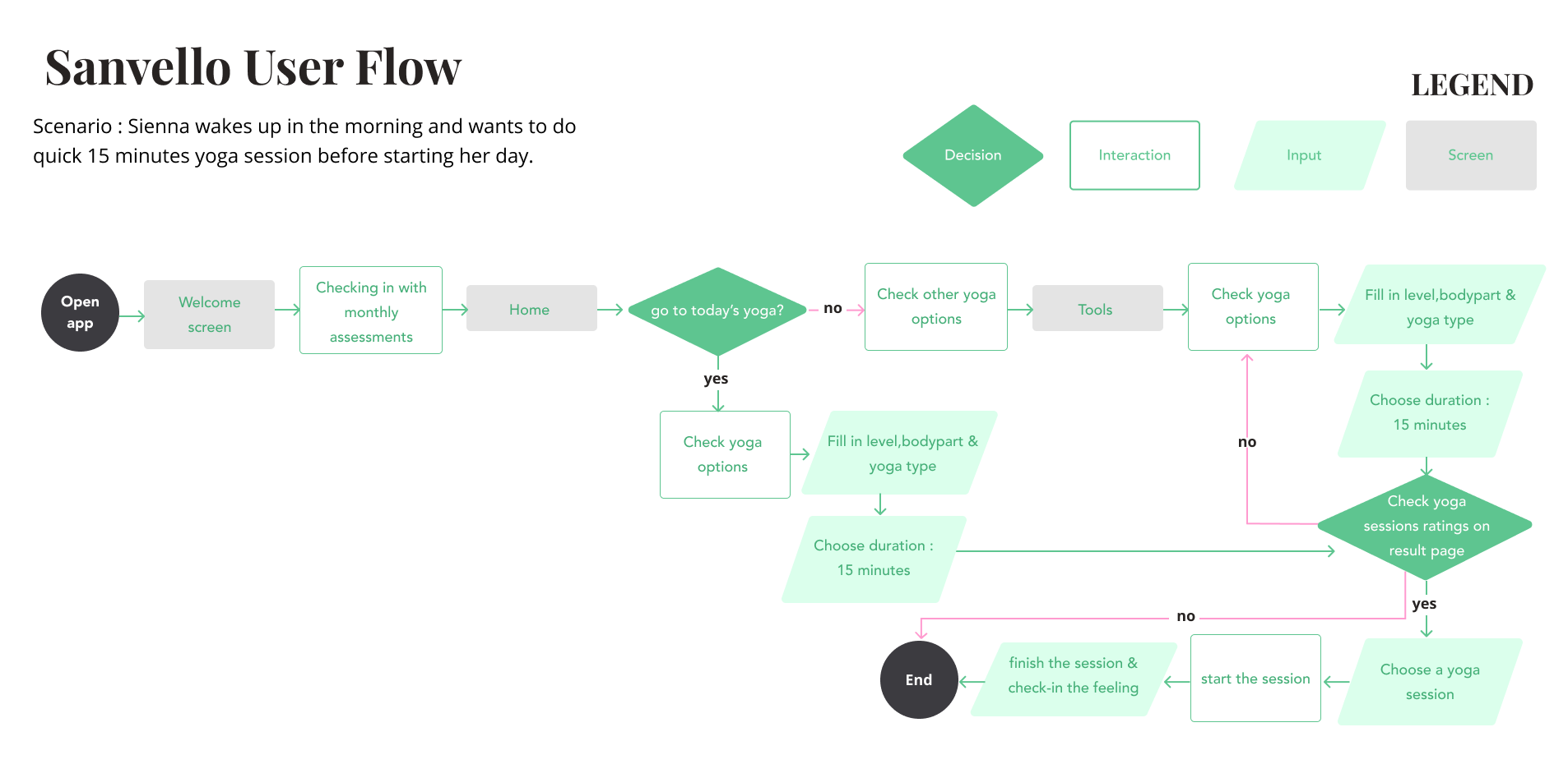
After discussing with people, I devised a user flow to visualize the different paths that the user persona, Sienna, could take a yoga session through the Sanvello app. The scenario that I chose to focus on was that Sienna wakes up in the morning and wants to do quick 15 minutes yoga session before starting her day.
Low-fi Wireframes
I came up with sketches for what the new features would look like in detail. I realized that Sanvello has usability issues, no filter option, and the categories option is at the bottom, making users often miss it. There is no filter option for a feature for meditation or collection. To improve this, I found some inspiration from various apps, and below is the hand sketch I did.
Mid-fi Wireframes
Referencing the sketches and considering possible alternatives, I created a mid-fidelity design. The wireframes included Home Screen, Tools Screen, Categories Screen, Live Screen, and Filter Screen. I decided to go with Categories screen 1. However, after receiving feedback, I added the Today’s Yoga section on top for better usability and removed the search box option as people prefer to see categories and filter buttons. I changed a few elements along the process as some are more effective than the earlier ideas.
” To test whether implementing the new features solved the pain points captured during the research phase, I created a clickable prototype on Figma.”
4. PROTOTYPE & TEST
Responsive Prototype
I created Hi-Fi Wireframes while remembering the flow and sticking with Sanvello Design System to be consistent. Preparing the prototype was fun but challenging at the same time because it had so many details and screens to make. I made some iterations along the way, such as adding extra screens for landscape video view for better usability, improving color contrast while sticking to the Design System, changing the position of categories for better priority, and making the live section bigger because it is not obvious to see. I believe it is necessary to focus on users to build the best platform. After some fruitful feedback and numerous iterations, below is the result.
Usability Test
Usability testing was conducted remotely via Zoom, and each participant was asked to complete a few tasks. The usability testing plan can be found here.
The goals for the usability testing:
1. To evaluate how good the usability rate of the yoga session experience on Sanvello ( if users can navigate everything smoothly)
2. To understand the potential pain points of users during tasks
3. To get feedback on the overall app design and features and improve user experience accordingly
Usability Testing Summary
Based on the findings, the prototype was a success with a 100 % completion rate with minimum delay or confusion to finish the tasks. The participants could locate today’s yoga and live yoga, use the filter smoothly and complete the tasks without any significant issues. However, it is essential to note that the usability testing also helped me identify areas of improvement. Check the full report of User Testing Findings here.
Priority Revisions
After learning the pain points and feedback from participants, I made some necessary changes to my high-fidelity screens.
Yoga Screen
Problem: Users missed “Live Sessions” because it looks similar to the rest of the categories.
How many participants said this?: (3/7)
Solution: Added a special section for “Live Sessions” and made all courses button more prominent.Problem: Users wanted “New Arrival”& “Live Sessions” on top to see the most updated sessions.
How many participants said this?: (2/7)
Solution: Moved “New Arrival”& “Live Sessions” to be on top of the screen.
Live Classes Screen
Problem: Users sometimes miss the month and date of the chosen session.
How many participants said this?: (3/7)
Solution: Added extra information of the month on top of the screen and a more obvious chosen date in different colors.Problem: Users wanted to know the status of the session, extra information, how many people have signed up, and if the session is full.
How many participants said this?: (3/7)
Solution: Added information on how many people have signed up, the information icon button, and if the session is full.Problem: Users wanted an extra step before confirming the booking.
How many participants said this?: (5/7)
Solution: Added a pop-up screen to confirm the booking of the session.Problem: Users thought the background was a bit too bright compared to the rest of the screens.
How many participants said this?: (2/7)
Solution: Change the background to align with the rest of the screens.
Session Booked Screen
Problem: Users are confused about how to exit from the confirmation screen.
How many participants said this?: (2/7)
Solution: Added an “x” button to exit the screen.Problem: Users thought the information was not detailed enough.
How many participants said this?: (1/7)
Solution: Added more information about the session.Problem: Users thought the CTA button was way too low and “add to calendar“was more important than “see you then.”
How many participants said this?: (2/7)
Solution: Move the CTA button higher and change the button.
Filtered Yoga Screen
Problem: Users are confused about which screen they are at.
How many participants said this?: (2/7)
Solution: Added breadcrumbs to make it clear.Problem: Users wanted to know which session was the most popular or the latest added on the app.
How many participants said this?: (3/7)
Solution: Added sort-by button.Problem: Users wanted to know briefly about the session.
How many participants said this?: (5/7)
Solution: Added tagging information for fast extra detail.
The Final Product
The new prototype with the priority revisions can be checked here.
5. REFLECTIONS
What I learned
Implementing new features to an existing app was a great learning curve for me to understand the consistency of the Design System of the Sanvello app. Recognizing the flow and comparing the screens from similar apps enriched my knowledge of different approaches to users. I enjoyed the exploration of ideas based on findings and gathered data.
Even though preparing interviews takes so much time and effort, I received so much valuable information to see problems objectively, which led me to the best solution idea. I learned that it is essential to listen to people and participants. Sometimes I miss some aspects because I prepared so much detail in a limited time, and they pointed out what was lacking from my design.
I learned deeper about the mental health industry and the possibility of utilizing digital technology for users’ convenience. It is a challenging market because there are many competitors in the industry.
Challenges I faced
Because Sanvello is an already existing app, I had to ensure that the yoga features I added were consistent with the design system, other features, and the overall look.
Before I conducted my user interviews, it was unclear what features and direction I should choose for the Sanvello app. However, after the interviews, it became more evident that the yoga app is what I should add.
Since English is not my mother tongue, preparing the Interview Guide can be challenging for me because it requires extra effort to choose wordings with proper grammar to collect the correct answers from participants.
Next Steps.
For this project, I focused on the yoga feature to provide a physical practice for Sanvello users to get an all-around health experience. The next step will be:
Another Usability Testing 1:1 for more depth feedback
Design a “Check in” screen after the yoga session, a rating and feedback screen for yoga sessions, a wishlist screen, and a yoga reminder screen.
Design for other mobile devices’ layouts.
Scheduling screens and connecting the app with google calendar.


