
Pervaaz App.
The Pervaaz iOS app is designed to help adult students and parents of young students learn Urdu. It provides easy access to digital materials and curriculum, offering the convenience of practicing Urdu both online and offline. With handy features like digital registration and payment, user profile creation, and notifications, this app makes learning Urdu more accessible and efficient.
Role : UX Designer
Client : Indus Art Council
Tools : Figma, PSD, AI, Google Sheet, Google Docs, Maze
Project Timeline : 80 hours

If time is limited, check out the 1 minute summary below.
SUMMARY
Why did I choose to do this?
Being an immigrant from another country, I value the significance of preserving my culture and language. Pervaaz, Urdu Language School, is an integral part of the non-profit Indus Arts Council. Although it currently has a landing page on their website, Pervaaz wishes to develop a more advanced platform that can cater to the needs of both their students and teachers.
Pervaaz desired a mobile application that simplifies the registration process, generates profiles for both parents and students to access the curriculum and materials both online and offline via their smartphones, and enables swift booking of in-person and online classes. A sturdy mobile app with a seamless user interface and an appealing layout would immensely benefit Pervaaz's business expansion.
How: build, measure, learn.
Using primary and secondary research, I identified critical problems and created a mobile app that (1) made Pervaaz’s registration and payment process more efficient and (2) made the registration and learning process seamless for users.
After a discussion with the stakeholder, we prioritized the MVP for registration and the app's main screens based on the project timeline.
I sketched two possible solutions for IA and ended up choosing one best structure as the most effective flow for users. Usability testing via Maze also gave many insights on improving usability for a better product.
Results After Usability Testing
I observed improvements in the following:
The average time of sign-up and sign in
Greater number of potential students
Ability to save student sign-up information for future programs
Easy notification for upcoming events
Profile creation and progress tracker in the program
Easy registration and payment
Communication with administration staff and teachers
Key learning points
Various challenges I encountered during this project were working with the stakeholder’s schedule and scheduling interviews with participants, which led to difficulties in meeting the project deadline. Even though these are common problems, I tried my best to be agile and take the initiative to finish the project as fast as possible.
This was a complex app with a specific market that required different personas of users for various roles. Instead of introducing too many features in one project, I learned that it is best to focus on one part as the app's foundation to be specific in solving the problem.
I could finish the project successfully with valuable feedback for the next round. The areas I need to work on are trying to be easier on myself when I cannot control the situation and still doing my best to deliver what I promised for the project.
Stakeholder reviews

Do you want to read the full story ? Keep scrolling, 10 minutes read.
Let’s do this!

Background
Indus Arts Council, a non-profit organization conceived in 2012, has become a leading Arts and Cultural Organization of Pakistani descent in the Houston area. Pervaaz is a platform under them that offers Urdu language classes for children, youth, and adults. Urdu is spoken by more than 100 million people, predominantly in Pakistan and India. It is the official state language of Pakistan and is also officially recognized, or “scheduled,” in the constitution of India. Pervaaz provides in-person classes in various locations throughout Houston, TX only on the weekend but online classes nationwide. They want to keep a bridge between their American-born children and their rich Pakistani heritage, which has bloomed into a cultural exchange between the surrounding global communities.
Problem
Pervaaz has a landing page on Indus Arts website but it is pretty basic and they find it not enough to accommodate students and teachers. They rely solely on the Indus Arts website and which provides basic information with sign-up and payment options only. The updates are pretty outdated with sending emails and Whatsapp chats together with other programs from Indus Arts Council. With growing language apps in the market, it is fair to say that Pervaaz needs some upgrades to compete with other Urdu language platforms.
Approach
I designed Pervaaz app to accommodate students in learning the Urdu language smoothly. Students can register, pay online, get updates and notifications with a reminder of classes, check the curriculum, and access digital material with ease. Also the idea of improving the language level with games and quizzes when they are in between classes.
Preview of Features

Problem: Pervaaz has no mobile app.
Solution: Preparing onboarding with easy sign-up and sign-in features for users.

Problem: Pervaaz has a conservative way of registration via the Indus Arts website and Whatsapp methods.
Solution: Prepare screens for registration and choose the course with easy payment via the app. Ideally, the system will save repeated students.
Problem: Users have difficulty reaching administration staff for extra information.
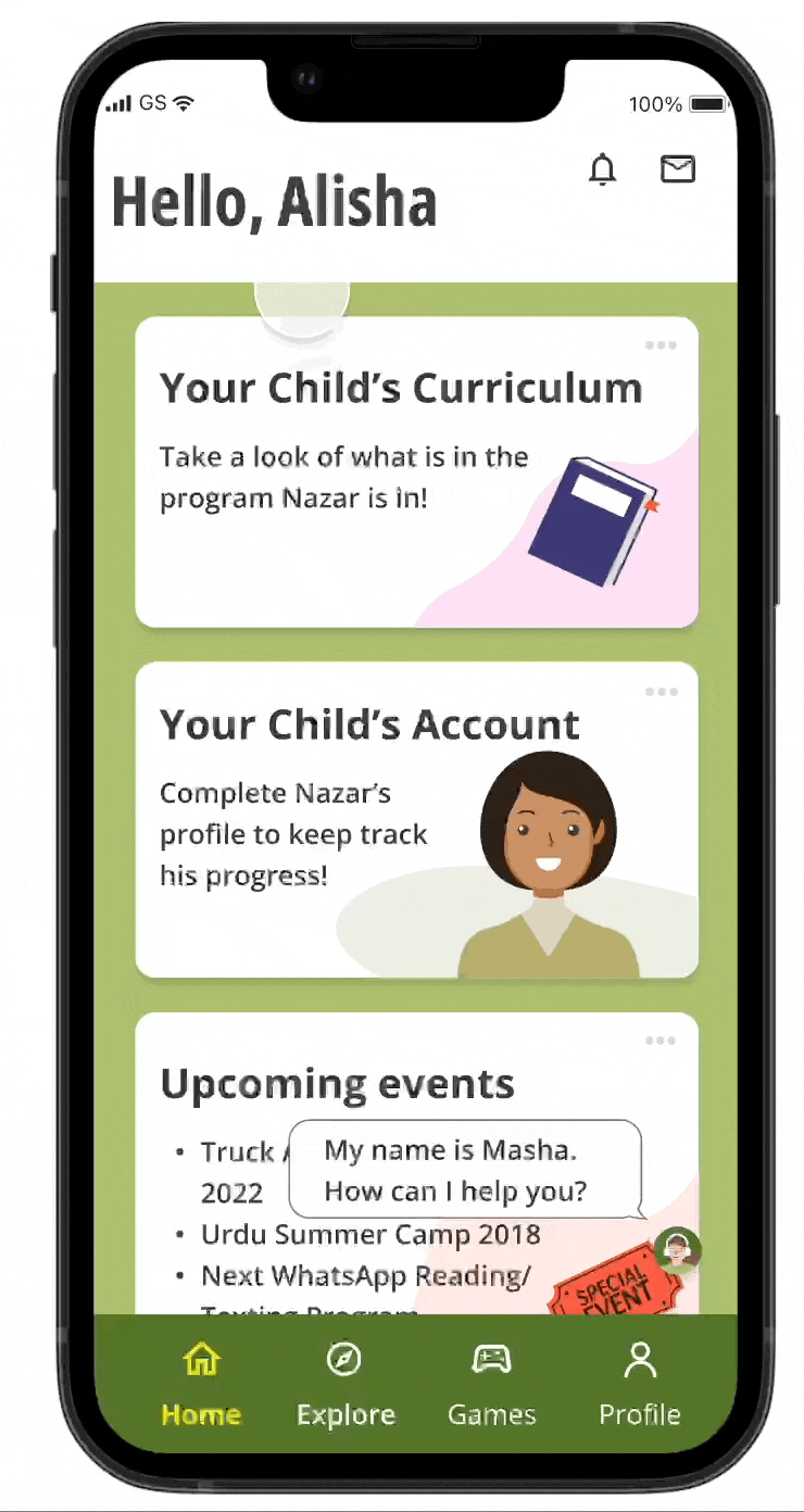
Solution: A floating chatbot that is easy to find on the Home screen so users can easily ask via chat, call, or email.

Problem: Users want to see the curriculum they are in and their progress in the program.
Solution: Create a profile screen for parents and children, together with curriculum detail and progress in the course.

Problem: Users want to practice not only when they are in the class.
Solution: Create explore and games screens to practice their Urdu language via games, quizzes, recommended podcasts, songs, and articles.
List of Contents.
1. Research
2. Define
3. Ideate
4. Prototype & Test
5. Reflections
1. RESEARCH

I did some research online to know how big is the language app in the market and surprisingly it is a huge business.
Language learning apps generated $8.21 billion in 2021, a 32% year-on-year increase
Duolingo made the most revenue of all apps, reporting $250 million in 2021
Just from these statistics, it is clear that people are interested to learn the language and they have a big interest to do it online. The limitation of Pervaaz can be a weak point and it is a great move to invest more in the digital sphere.
Competitive Analysis
I conducted a competitive analysis based on the competitors and added some that are similar and I can see what opportunities for Pervaaz have to strive in the industry.

My main findings from my competitive analysis include:
Not every platform is specific teaching Urdu language with quality material and teacher
Not every platform provides online and offline material
Curriculum is not detailed and clear
Not enough recommendations for material such as books, podcasts, articles, and songs
“After secondary research I see few opportunities for Pervaaz but I want to have more clarity after I ask real users for interview..”
User Interviews
Once I had the competitive research and see what is the opportunity in the market and what I need to build for Pervaaz, I conducted user interviews to better understand their motivations, wants, and needs for the app. Participants are adult students and parents of young students who have participated in Pervaaz program previously. Total of 5 participants from 27-43 years old with occupations of realtor agents, lawyer, orthodontist, and office manager. The findings from the interviews can be found here.

“I finally get more insight of what features are important for users.”
2. DEFINE
Affinity Map
I created an affinity map to acknowledge and target the goals, motivations, needs, and pains of the participants. I started by taking notes of important feedback and gathered them according to different categories. At first, I thought the flow of the app will be the same for everyone (students and parents ) but I found interesting insights from the interviews and it gave me clarity of their expectations from Pervaaz app.

Persona
From the affinity map, it is clear that the demands from adult students and parents for young students are not the same hence 2 personas are created to make the features and flows clear for the app. With focusing on signing up and registration for students who are adult students and parents for young students, I created 2 personas below.
Persona 1 Alisha Abbasi, a parent of a young student

Persona 2 Haniya Baqri, an adult student

Project Goals
Using all the findings I have from research, I created a Project Goals Map of the business, user, and technical sides. This gave me a clear idea of the logical goals at a high level.

“I imagine the flow when users open the Pervaaz app and what is the easiest flow of opening the app, choosing the course, registering, and finishing it with payment.”
3. IDEATE
Information Architecture
With the user-centered problem statement by my side, I started to map out possible IA. I created two options, but after asking a few people for the best one, I decided to go with the one below. Users feel more familiar with signing up for the app before choosing the course and making a payment. Check the other option here.

User Flow
There are two user flows I created for each persona. I tried to develop various flows, and after checking different apps and asking for feedback from some people, I decided that the below are the most effective flows for those personas. The difference here is not complex but requires different screens and forms. It is because for parents to register their children, they have different course categories, and profile screens (check Alisha) than adult students register themselves (check Haniya).


Low Fidelity Wireframes
I began to sketch a few possibilities of what screens and features are necessary. I found some inspiration from various language apps. I tried to make four main screens: the home screen was created to be simple yet informative to see in a brief moment, explore screen to provide valuable sources for learning, games screen to be a fun yet supporting learning tool for students on the go, and profile screens for parents and adult student to be straightforward and user friendly to check their account, progress and easy communication to teachers and administration staffs.
Mid Fidelity Wireframes
Mid-fidelity wireframes included four main screens. I changed a few elements along the process as some are more effective than the earlier ideas. At first, I didn’t think it needed onboarding, but someone mentioned the sign-up process during a group meeting and how the screen starts for first-time users. Hence, it makes sense to understand this app and not immediately jump to the home screen.
For the explore and game screens, the level will be adapted to the level of registered students once they sign up for the program. Young students can access explore and game screens with parental supervision.
I created profile screens for adult students and parents for young students differently because parents will have access to the app for registration and contact the teacher or administration staff. Ideally, in the future, parents can register more than one child and keep their progress on their profile screens under them, but for this project, they can register one child only.
Click here for the complete screens of wireframes.

Style Tile
Once the main flow and wireframes were done, I created a style tile with the brand's color palette and font styles. I chose icons and feel that are suitable for the brand image, which is casual, friendly, and motivating.

” To test whether the app is working and according to expectation based on collected data, I created a prototype on Figma and ran the test via Maze.”
4. PROTOTYPE & TEST
Responsive Prototype
I created Hi-Fi Wireframes while remembering the flow, what is the goal, and are essential points but keeping it simple with minimum cognitive load. I used the brand's color palette and started to design every screen, especially the opening, main screens, and registration sections. I asked some people regarding the initial designs and noted all feedback; below is the result.

Usability Test
I then conducted usability testing remotely via Maze, and each participant was asked to complete a few tasks. The usability testing plan can be found here.
The goals for the usability testing:
1. To evaluate how good is the usability rate of the Pervaaz app experience ( if users can navigate everything smoothly)
2. To understand the potential pain points of users during tasks
3. To get feedback on the overall app design and features and improve user experience accordingly
Usability Testing Summary
It was my first time using Maze for Usability Testing, it is interesting to compare this method with the 1:1 test method. I learned that combining both ways is the best approach for Usability Test if the time is enough. I managed to do the test to 17 male and female participants in total, who have used language apps for themselves or their kids with a range of ages from 27 - 44 years old. Since it was an unmoderated test, it took some time for participants to understand how Maze works. However, the prototype was successful, with a 100 % completion rate, and they could finish tasks without significant issues. However, there was some critical feedback to improve usability rates. Check here for the full report.

Priority Revisions
After learning the pain points and feedback from participants , I made some necessary changes to my high-fidelity screens.

Sign Up Screen
Problem: Users are confused with the automatic “Sign In” option on the Prototype.
How many participants said this?: (2/17)
Solution: Added “Join” or “Sign In” option after onboarding screens. I have changed the font and layout to align with the app's form.

Home Screen
Problem: Users thought the contact us button was the chat bubble on top.
How many participants said this?: (4/17)
Solution: Change the chat icon to be inbox icon on the navigation.Problem: Users thought that the curriculum for adults or children on the home screen is not clear enough ( I have stated that in the app, but maybe it is not clear enough )
How many participants said this?: (2/17)
Solution: Make the title in the box more precise for adults or the child.Problem: Users didn’t like to scroll all the way down to find the contact us button, and they wanted it to be available on the screen every time.
How many participants said this?: (5/17)
Solution: Change the contact us button with a floating chatbot button so it is accessible from every screen, and add an automatic question.

Course Screen
Problem: Users thought that the kinder or adult course drop-down was not that obvious to click.
How many participants said this?: (3/17)
Solution: Make the box’s line bolder and kinder and adult courses on the same page to avoid confusion.Problem: Users wanted to know if the class was full or still available.
How many participants said this?: (1/17)
Solution: Added extra information on how many spots are left or fully booked.

Check Out Screen
Problem: Users have no flexibility to go back and change their choice.
How many participants said this?: (3/17)
Solution: Add a back button, so they have the flexibility to fix their error.Problem: The user is confused with the pay later option.
How many participants said this?: (1/17)
Solution: Remove the pay later option for now and discuss more options at a later stage.
The Final Product
The new prototype with the priority revisions can be checked here.
5. REFLECTIONS
What I learned
Building a new app with a different types of personas was a great learning curve for me, it made me explore various possibilities and enrich my knowledge with different approaches. It also gave me an insight into what is essential for parents, for their children’s education can be so different for adult students. It challenged me to find the middle ground to accommodate both personas efficiently.
Using Maze for Usability Testing is something I wanted to do as I believe exploring different research tools can broaden my knowledge in the future. The challenge here was to understand how Maze works and to run the test in a short period. It was interesting to see which areas of the screens were used intensely in the data. Also, I learned that having expected clicks before running the test was crucial in determining the success of the test.
The feedback for the usability and the design are eye-opening to improve the app, mainly after I worked so much preparing all the screens, I might miss some points and details.
I learned deeper about language learning education and how to translate it to the app. Essentially, how to help users learn the Urdu language and utilize digital technology effectively to achieve the best learning process.
Challenges I faced
As this is the first time for me to collaborate with non-profit organizations like Pervaaz. It was challenging for me because they had other priorities, making the project pace less fast than expected. Working with different people in an organization requires intense communication and understanding to reach the same goal.
Since the market is specific, I have some contact with students and parents from Pervaaz, but it is not easy to organize interviews with them because people are busy with their schedules. However, it went well even though it took longer than I expected.
Because this project takes longer than other projects, I sometimes lose the motivation to keep going. Nevertheless, I joined UX Design seminars and UX Design networking events. I met many inspiring people in the industry, pushing me to keep going and do my best.

Next Steps.
For this particular project, I focused on main screens, sign up and sign in together with registration and payment flow and layout for adult students and parents for young students. The next step will be:
Another Usability Testing 1:1 for more depth feedback
Profile creation for administration staff and teachers
Detail features on Explore screens and Games screens
Scheduling screens and connecting the app with google calendar and social media such as Whatsapp
Hand in the project to the developer team to run and launch it for the first quarter of 2023