
Mirror.
Mirror is a clothing brand that wants to expand to the digital sphere without neglecting the obstacle of the non-physical touch and feel of products for customers. A responsive website with digital try-on clothing features is designed to reduce fatigue of sizing problems for users.
Role : UX Designer
Client : Mirror Clothing Company
Tools : Figma, PSD, AI, Google Sheet, Google Docs
Project Timeline : 80 hours

If time is limited, check out the 1 minute summary below.
SUMMARY
Why: Is it a problem worth solving, can it be solved and is there a market for it?
Online shopping is getting more popular especially after Covid 19 and it is important for Mirror who has strong offline presence to expand their business to online sphere especially if they want to compete in the market and try to clean up their inventory in their warehouse. If they want to keep up their business internationally, it is important to reach the potential users by providing them omnichannel throughout devices and physical stores.
Outcomes: learnings.
It is my first case study of UX design, I was learning necessary steps and how to tackle the problem with exploring various possibilities while using the strength I have from my background.
The market is quite broad so it is not difficult to find participants, however, designing the website with colour combination and feel was challenging because the market is huge and it is difficult to make it stand out but not too basic while fitting every category.
I learned so many things from research, time management, approaching and contacting new people, it was a good learning curve to get a valuable feedback. The areas I need to work on are trying to be more patient and not too ambitious because learning new things can be overwhelming and it takes time to digest and be good at it.
Do you want to read the full story ? Keep scrolling, 10 minutes read.
Let’s do this!

Background
Mirror started back in 1994 as a clothing store targeting a budget-minded audience who looked for low-cost clothing for both kids and adults for formal and informal styles. They have over 400 stores around the world in 32 countries.
Problem
Mirror has a very outdated logo that they are looking to re-do
Mirror is very successful offline but no online platform
Mirror has plenty of remaining inventory in their warehouses that are very difficult to move if there are only a few pieces left, for which online selling would be a solution
Project Goals
Make modern logo which make Mirror competes better with improved image
Create attractive online platform - a website to sell and connect with customers
Clean the inventory with different kind of advertisement online
Create a successful responsive clothing website which provides smooth user experience anytime and anywhere.
Approach
I designed a responsive website containing a shopping online, profile creation, virtual fitting room, various payment options and an e-commerce storefront. Users can check product, try their size with virtual fitting feature, virtual stylist, check the reviews and save their wishlist with their profile. They are able to check every product in detail with clear material and comment from other users’ reviews before deciding to buy it. It is also a platform to engage better with customers with their special advertising and promotion.
Preview of Features

Problem: Mirror has no online website while they are doing great offline for brick and mortar stores.
Solution: A responsive website is created in order for Mirror to have strong presence in online sphere.

Problem: Mirror has no website with online shopping feature to boost their business apart from their physical stores.
Solution: A responsive website with online shopping feature is created so users are able to shop conveniently from anywhere.

Problem: Users find that it is difficult to know if the clothes they choose online will fit them by look and size.
Solution: Virtual Fitting feature is added on the website to help user with this problem.

Problem: Users find that it is convenient to have saved wishlist and they can revisit the list to order them.
Solution: Sign up and sign in page is created so they have profile to save information, wishlist, sizes and preference in the system
List of Contents.
1. Research
2. Define
3. Ideate
4. Prototype & Test
5. Reflections
1. RESEARCH
It was an essential step to understand the trend and market for Mirror. Here are some of my key insights from my secondary research:

Competitive Analysis
Competitive analysis was conducted to understand the market and know how to compete in online fashion sphere. These brands were chosen based on similarities of target market and they have strong online presence. This helped me identify their design patterns and evaluate the key importance of some features.

My main findings from my competitive analysis include:
Fashion e-commerce industry is very competitive & aggressive.
It is challenging to customise Mirror website design because target market is broad.
Brands are very innovative and creative with their marketing.
Filtering and sorting products are also essential part.
Various important aspects to offer digitally, eg.clean picture, material information, easy delivery and returns.
Important to build trust and make customer loyal to the brand.
“After secondary research I see few opportunities for Mirror but to have more clarity I need to understand the needs from market .”
User Interviews
I conducted Interview to understand more in depth of how people feel and think when they are doing clothing online shopping. I was able to conduct a successful interview involving 4 participants from 25-35 years old, with 1 male and 3 females. I get useful insights of uncovering their motivations, wants and needs for clothing online shopping. I wrote down the outlines in my Research Findings of all important details. The following are my findings uncovering their motivations, wants and needs.
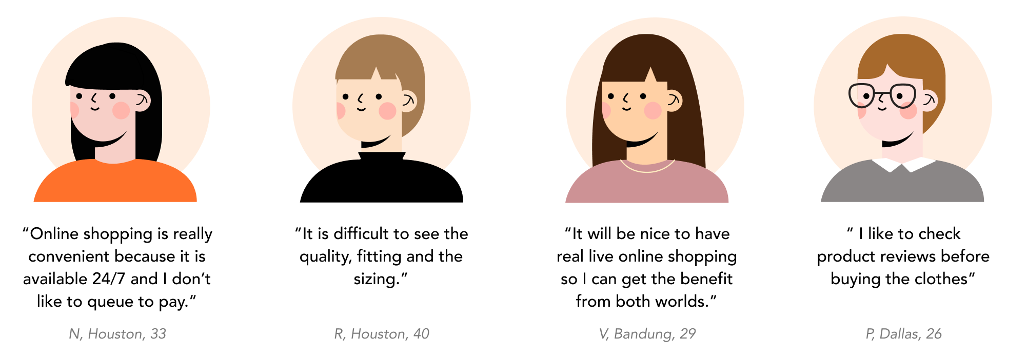
“E-commerce is growing faster than ever, however, does industry really understand what are customers' demands and expectations? I dig deeper to find the best approach and building successful UX for Mirror.”
2. DEFINE
Affinity Map
Next, I created an affinity map to acknowledge and target the goals, motivations and pains across the participants.

Persona
After reviewing and summarizing the interview results, I created a persona to guide me and relate to what user thinks and feels and help me to create the Site Map and User Flow for the website. Chloe is a persona who represents the market. She is a professional who works in a big city, interested in fashion but doesn’t want to spend so much on clothing. She enjoys the convenience in buying clothing online.

Project Goals
After persona, using all the findings I have from research, I created a Project Goals Map of the business, user and technical sides. This made me have clear idea of what to focus on Mirror website.

“I imagine the flow to find a product from clothing website and what options and possibilities are available. I was inspired by checking direct competitors sites such as ASOS, Shein and H&M..”
3. IDEATE
Persona Storyboard.
As a working professional in a big city, Chloe uses her phone often for various reasons including shopping online, social media and paying the bills. Due to the busy traffics, she doesn’t like the hassle to buy clothes in-store because she finds it troublesome. While buying clothes online has another disadvantages, especially about the sizing, how it fits and also paid shipping and returns. She finds it frustrating because she likes to look trendy but she doesn’t like to exhaust herself browsing for hours. She is also not a big fan complicated filtering. She is conscious of her spending so pay later option is a huge priority. Given these points, the smooth and affordable shopping experience is something she is craving for.

User Flow
This user flow is based on Chloe experience in finding a dress:

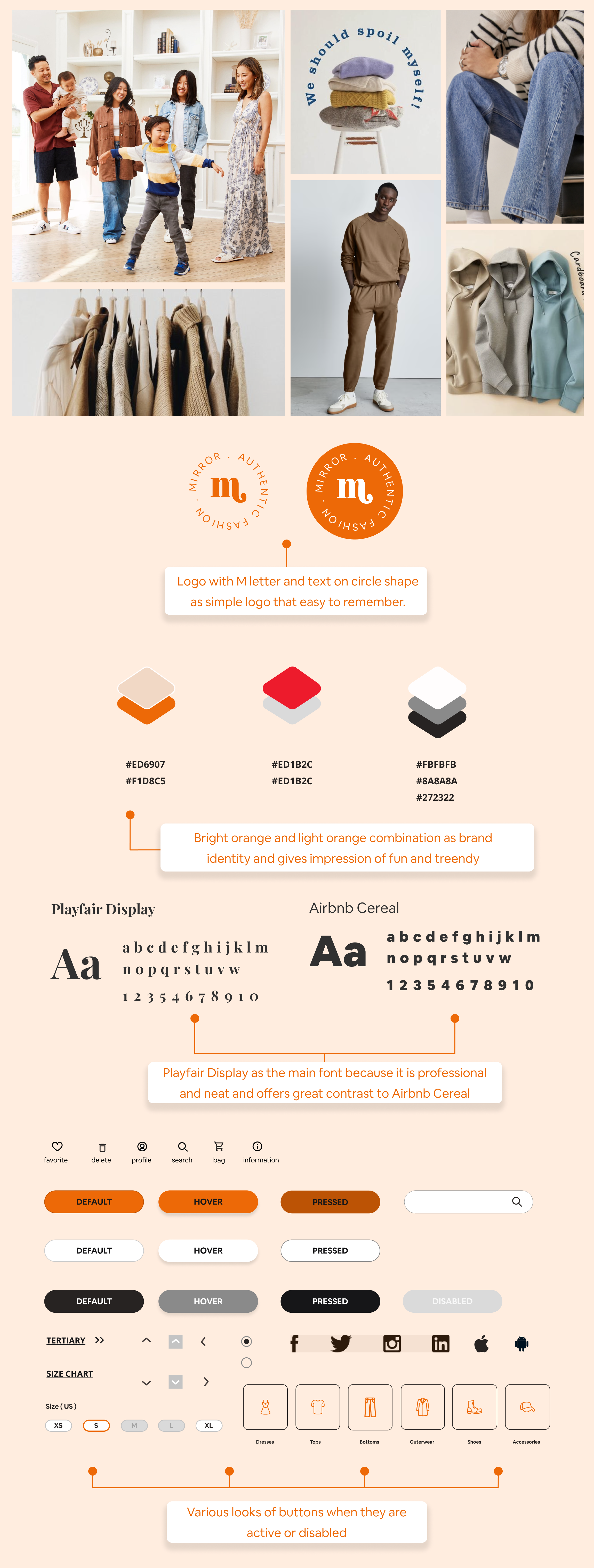
Rebranding The Logo

I made some sketches based on the research I did. It is family friendly yet modern but simple and fun at the same time.
It has dynamic and represents the brand in competitive market. I did survey to have clarity which one is the most attractive design.
Low-fi Wireframes
Firstly I created hand-sketches then created mid-fidelity wireframes for the Homepage, Category Page, Product Details Page, Virtual Page and Checkout Pages.

Mid-fi Wireframes
Referencing the sketches and consider some possible alternatives, I created mid-fidelity design with focusing on the best flow and most ideal user experience based on the research, demand and feedback from users. I also get some insight by examining several fashion websites.

Moodboard & UI Kit
Next, I created a moodboard for design inspiration together with UI Kit. Based on the brand value and direction, orange colour was chosen as the core colour. Orange is associated with meanings of joy, warmth, enthusiasm and creativity. I chose Playfair Display font because it looks professional and neat together with Airbnb Cereal that more casual and fun. This combination is easy to read for broad market from young to older generation.
“How should I build it? Prototype was prepared for usability test. I wanted to see what goes well and which part needs to be improved.”
4. PROTOTYPE & TEST
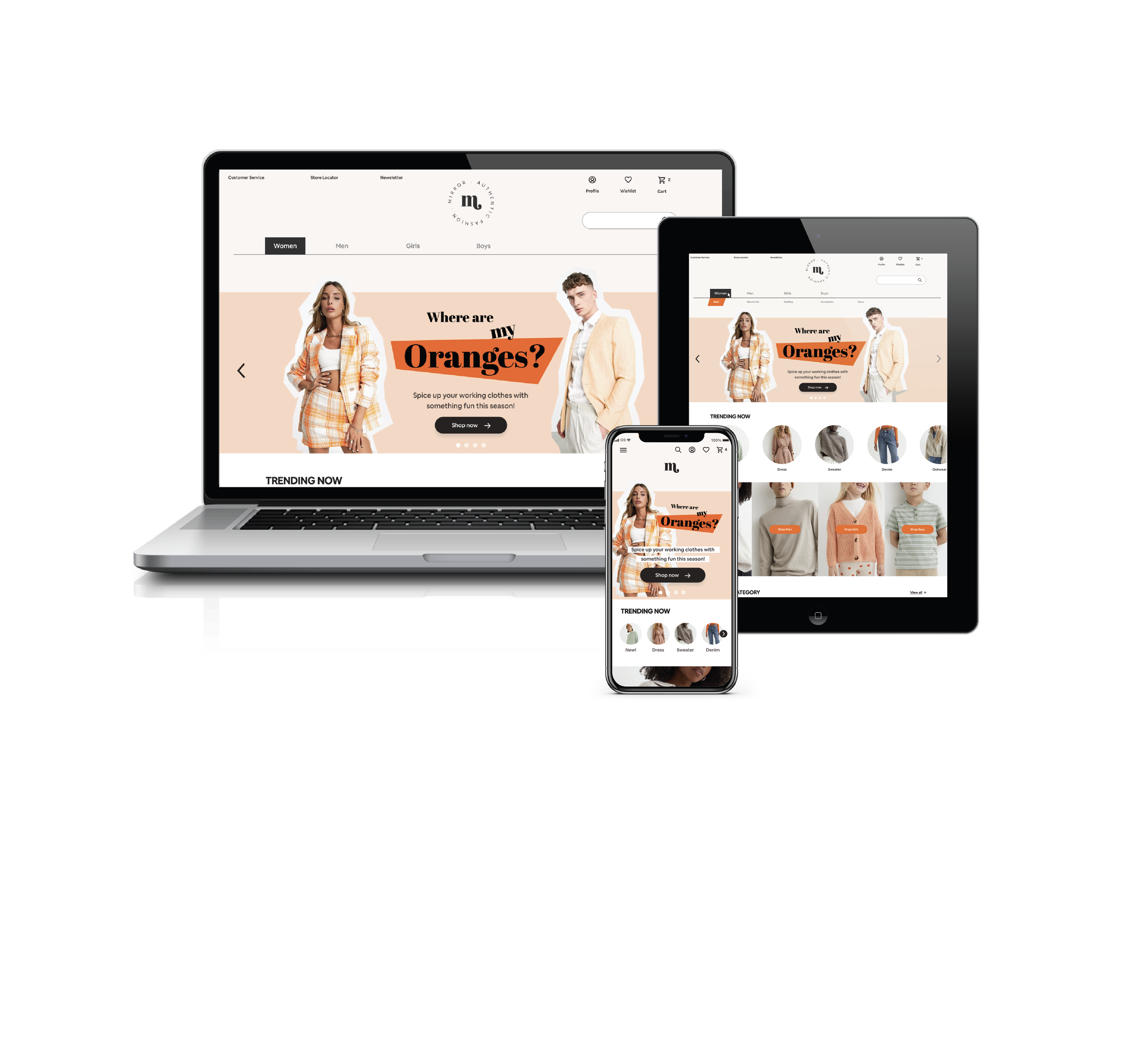
Responsive Prototype
I created Hi-Fi Wireframes while remembering the flow, what is the goal and what are important points without making it too complicated, clear with less clicks and keep it simple. I want to promote the online ordering too since that will boost the sales for YIP Hauz Cafe. I made some iterations along the way especially for the Homepage because I received feedback from users and I am opened with any feedback to improve User Experience and I believe it is necessary to focus on user in order to build the best platform. After some fruitful feedback and numerous iterations, below is the result.

Usability Test
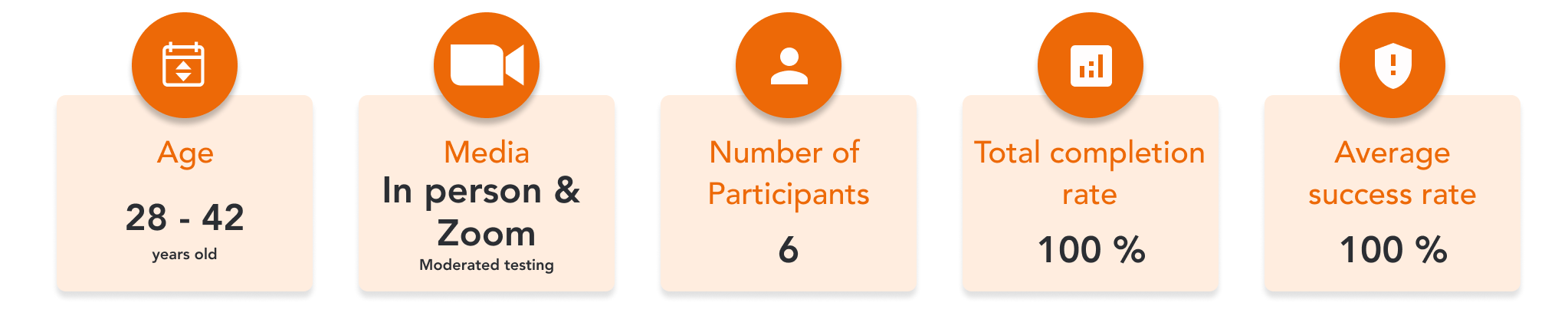
I tried to recruit wide range of participants within Mirror's market to bring various insights into my design iterations. I have recruited 6 participants, whom align with my provisional persona form both genders. They were different participants than my research phase because I want to gain more insights from different perspectives. I also received extra feedback from group crits at Designlab. I chose combination of in-person and remote moderated testing for Usability Testing. view Usability Test Planning here.
The goals for the usability testing:
Define whether users think it is easy to navigate the menu and find products. Is the navigation easy to use and understand?
Define about what users think of the overall design of the website. Is that attractive and engaging them to shop?
To identify any potential pain points for users and why.
Define whether the check out and payment process are smooth and clear.
To determine the Virtual Try On is helpful, easy to use and boost users’ confidence to purchase products online.
Define potential aspects for users to purchase more and loyal to Mirror
Usability Testing Summary
The usability testing and the prototype were a success with 100 % completion rate with minimum delay or confusion to finish the tasks. They like the overall design and flow, I have gathered the priority iterations note. Check the full report of User Testing Findings here.
Priority Revisions
After learning the pain points and feedback from users, I made the necessary changes to the prototype.
01. Homepage

02. Product Page

03. Virtual Fitting Page

04. Shopping Bag Page

05. Sign Up Page

The Final Product
After the iterations, the responsive website project is completed!
5. REFLECTIONS
What I learned
Always ask “WHY” before sketching and designing
Practicing design thinking is essential in building a website
Design systematically - Learning how to design systematically was also part of my growing path in this project.
Performing usability test is essential for a successful website to be not biassed with our own subjective assumption
Different voices matter - Empathise people based on their experiences and feedback is a huge part in understanding what works and what are pain points of online shopping process.
Challenges I faced
I started this Mirror Website project as my first hypothetical case study in UX design and a lot of new terms I learned along the way. To think objectively and decide based on collected data instead of subjective assumption.
It is not easy to empathize the users while considering the business perspective at the same time, but it is important to deliver the result and make everything smoothly for both parties.
Next Steps.
Create Screens for tablet and mobile devices
Plan more quantitative & qualitative research
Plan another Usability Test