
History Trails Feature.
HCSS Telematics is a comprehensive GPS equipment tracking software and hardware solutions help people to manage entire mixed fleet in construction industry.
History Trails feature is created to provide Telematics web users the ability to track the history of their fleet and pull relevant data on Map 2.0.
Role : UX/UI Designer
Company : HCSS
Tools : Figma, AI, Google Docs, Google Meet
Project Timeline : 8 weeks in research and design
Platform : Web based product

If time is limited, check out the 1 minute summary below.
SUMMARY
Why did they choose to do this project?
Telematics is currently upgrading its mapping system to remain competitive in the market. Alongside this, they are transitioning to an updated Design System, which is being integrated into their products. This includes revamping old features to improve user experience.
One key feature under renovation is the history trails function. While it works, it is not as efficient as it could be and needs improvements based on customer feedback. Customers want this feature to be more effective, offering a variety of information on the map while remaining easy to understand and user-friendly.
How: build, measure, learn.
Through primary research and direct customer interviews, I identified key issues and developed a new version of the History Trails feature with an updated UI and more effective user workflows.
Following discussions with stakeholders, we decided to divide this large project into several phases. This phased approach is necessary due to our transition from Bootstrap to React, along with implementing a new Design System and updated appearance.
I created several sketches and potential solutions, working closely with stakeholders and the UX team to develop robust workflows. Validation interview with customers provided valuable insights, which I used to address any gaps and further enhance the feature before final implementation.
Key learning points
During this project, I faced several challenges. Gathering extensive information from different people such as Dev Manager, Product Manager, Technical Product Manager, Quality Assurance, SME, was necessary due to the project's complexity, and understanding which aspects to prioritize was crucial.
Scheduling interviews for discovery and validation with customers proved time-consuming due to their busy schedules. It was essential to follow up tactfully, emphasizing that their feedback would help solve their problems in the future. Despite these hurdles, I successfully met the project deadline.
Given the project's broad scope, I focused on the main priorities, leaving some secondary aspects and details for the next phase. This approach prevented the development team and me from being overwhelmed by the volume of work. Pair testing with the development team was particularly enjoyable and provided valuable insights into their feature-building process. It also helped me understand how to better deliver my designs with the necessary information and components for future projects.
The project was completed successfully, receiving positive feedback from my manager, stakeholders, and customers. I am pleased that my hard work paid off. Moving forward, I aim to improve my utilization of the new Design System and interactions for the web product.
Stakeholder reviews

Do you want to read the full story ? Keep scrolling, 10 minutes read.
Let’s do this!

Background
HCSS Telematics offers a comprehensive GPS equipment tracking software and hardware solution designed for the construction industry. It enables management of an entire mixed fleet, providing tools from dashcams to protect drivers and reduce accident and insurance costs, to geofences, OEM links for data integration between HCSS and equipment manufacturers, and monitoring of driver behavior, machine data, and Electronic Logging Device (ELD) information.
One notable feature is History Trails, which tracks the historical movement of equipment on a project, whether for single or multiple pieces. This functionality allows customers to understand road events, such as details leading to accidents, the best routes to the field, and traffic comparisons. It provides managers with a clearer picture of field events and situations, enhancing decision-making and operational efficiency.
Problem
The current History Trails feature is outdated and has limitations in tracking equipment. It only functions when users select specific equipment, but customer feedback indicates a desire for additional features, such as location options and temporary locations. Additionally, the map interaction is not user-friendly, with some buttons not working properly. The feature currently uses Bootstrap components, but we aim to transition to React and incorporate the new HCSS UI Design System for a more modern, sleek, and effective interaction.
Given the aggressive competition in the market, it is crucial to stay relevant to user needs and expectations. Upgrading History Trails will not only address the existing issues but also enhance the overall user experience, ensuring Telematics to remain competitive.
Approach
I designed the new History Trails feature based on feedback gathered from discovery interviews and collaborated with stakeholders to prioritize requirements. The updated design allows users to track multiple pieces of equipment on the map, including geofence locations, with the ability to easily edit these areas. A significant improvement is the addition of a feature that enables users to create temporary areas on the map, allowing them to see which equipment was involved in a specific location.
Preview of History Trails
Before Version
Problem: The current History Trails feature in Telematics is outdated and has numerous limitations and bugs, hindering users' ability to effectively utilize it.

After Version
Solution: To enhance the History Trails feature, we will leverage the new design system, adding the requested location capabilities and making the experience more interactive. This update will fix existing bugs, streamline user interactions, and align the feature with current market expectations. The improvements will include:
Implementation of the New Design System: Transition from Bootstrap to React with the new HCSS UI Design System for a modern, sleek, and effective interface.
Enhanced Tracking Capabilities: Allow users to track multiple pieces of equipment on the map, including geofence locations and temporary areas.
Interactive Map Features: Ensure all map interactions are smooth and responsive, with properly functioning buttons and user-friendly controls.
Bug Fixes and Performance Improvements: Address all known issues and optimize the feature for a seamless user experience.
User-Centric Enhancements: Incorporate feedback from discovery interviews, such as adding location options and the ability to create and edit temporary areas on the map.
List of Contents.
1. Research
2. Define
3. Ideate
4. Prototype & Test
5. Reflections
1. RESEARCH

Understanding The Problems
I met with stakeholders to brainstorm desired workflows for the History Trails feature. We discussed the shortcomings of the current workflows, interactions, and user experience. Together, we created a list of business and UX requirements for the project. The goal is to enhance the History Trails feature to make it more competitive in the market.
“After understanding the goals and requirements from stakeholders, I began building my case by seeking more details about the problems and needs from our customers. This deeper insight will guide the development of an improved History Trails feature that aligns with both stakeholder objectives and customer expectations.”
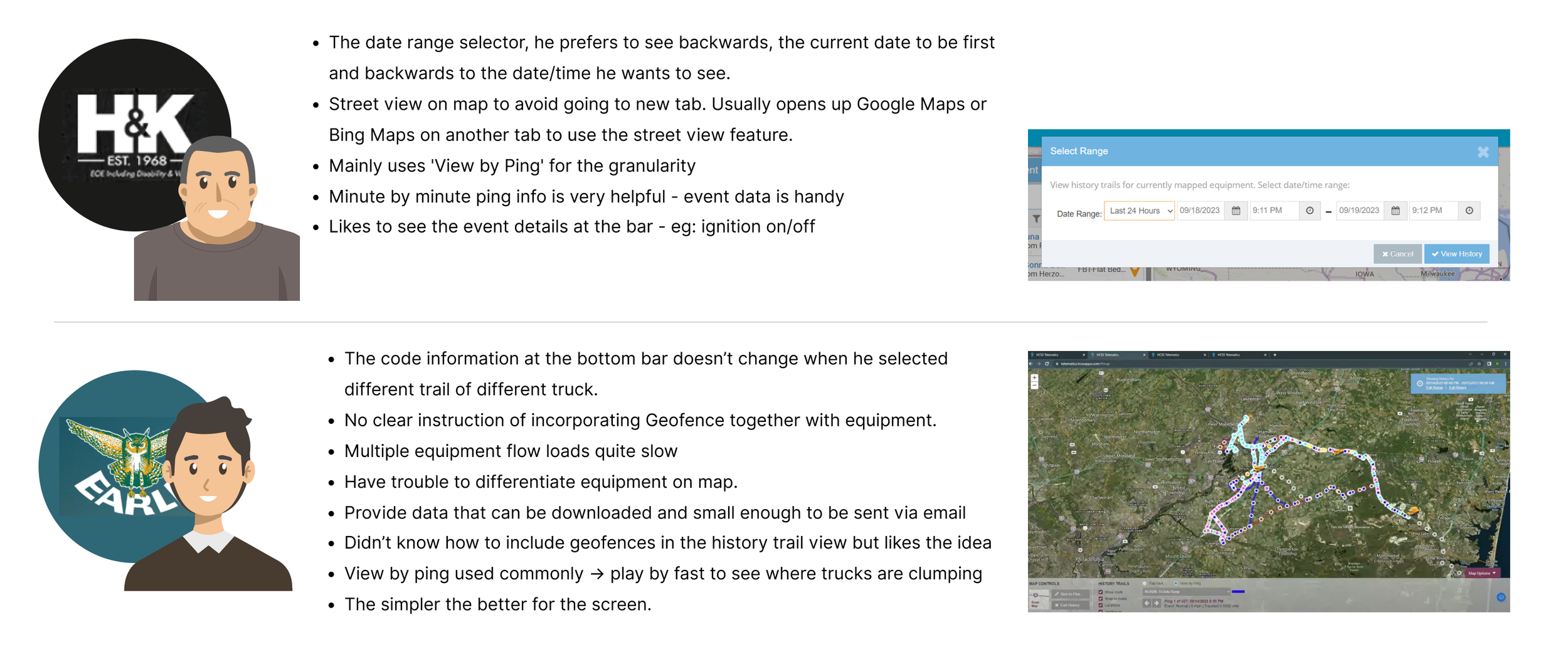
User Interviews
I conducted user interviews to have a better understanding of the problems, wishes and motivations for the feature. I had two interviews with a Fleet Manager from H&K Construction and Logistic Analyst from Earle Construction. Check some of the findings below:
2. DEFINE
Affinity Map
I created an affinity map to organize the goals, motivations, needs, and pains expressed by customers. Starting with notes of important feedback, I categorized them into different groups. The wealth of detailed information was largely expected, but some insights were surprisingly new and intriguing. Understanding the diverse use cases and priorities across different companies has been particularly fascinating.

Persona
To understand and empathize with the users, I focused on these two personas. Considering how they do their tasks and how they utilize History Trails feature.
Persona 1 : Gregory Hamilton, Owner/ Executive Manager

Persona 2 : Kenneth Anderson, Shop Manager

Project Overview and Goals
Utilizing all the findings from my research, I crafted a comprehensive Project Overview. This provided a clear, high-level understanding of the logical goals to pursue.

“I envision a seamless flow for users when they open the History Trails feature, ensuring they can effortlessly navigate and utilize it according to their specific case and information needs.”
3. IDEATE
Information Architecture

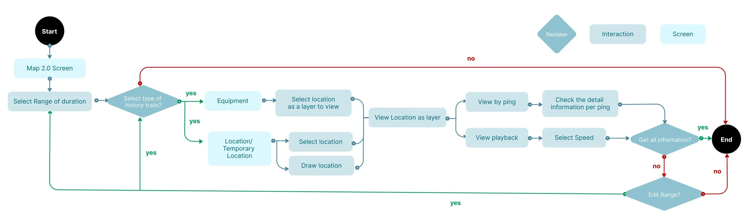
Workflows
The current workflow for History Trails is limited, offering only two options for viewing: by ping or playback. Additionally, there's no capability to draw locations to execute certain features. Another drawback is the lack of interactivity in the detailed map information. I aim to enhance these aspects in the new workflows.

In the new workflow, users have the ability to create temporary locations, enhancing the feature's flexibility. The interface is interactive, allowing users to select information from both a dialog and the map itself. Editing selections is seamless and intuitive, ensuring a smooth user experience. Additionally, geofences are now displayed as a layer, providing users with a clear overview of the sites involved in the history.
Low Fidelity & Mid Fidelity Wireframes
Drawing inspiration from websites like Samsara, True Connect, and Google Maps, I started sketching potential layouts. I focused on incorporating important information and visualizing detailed workflows into screen designs. These sketches served as a basis for sharing my ideas with stakeholders, ensuring alignment and feedback early in the process.

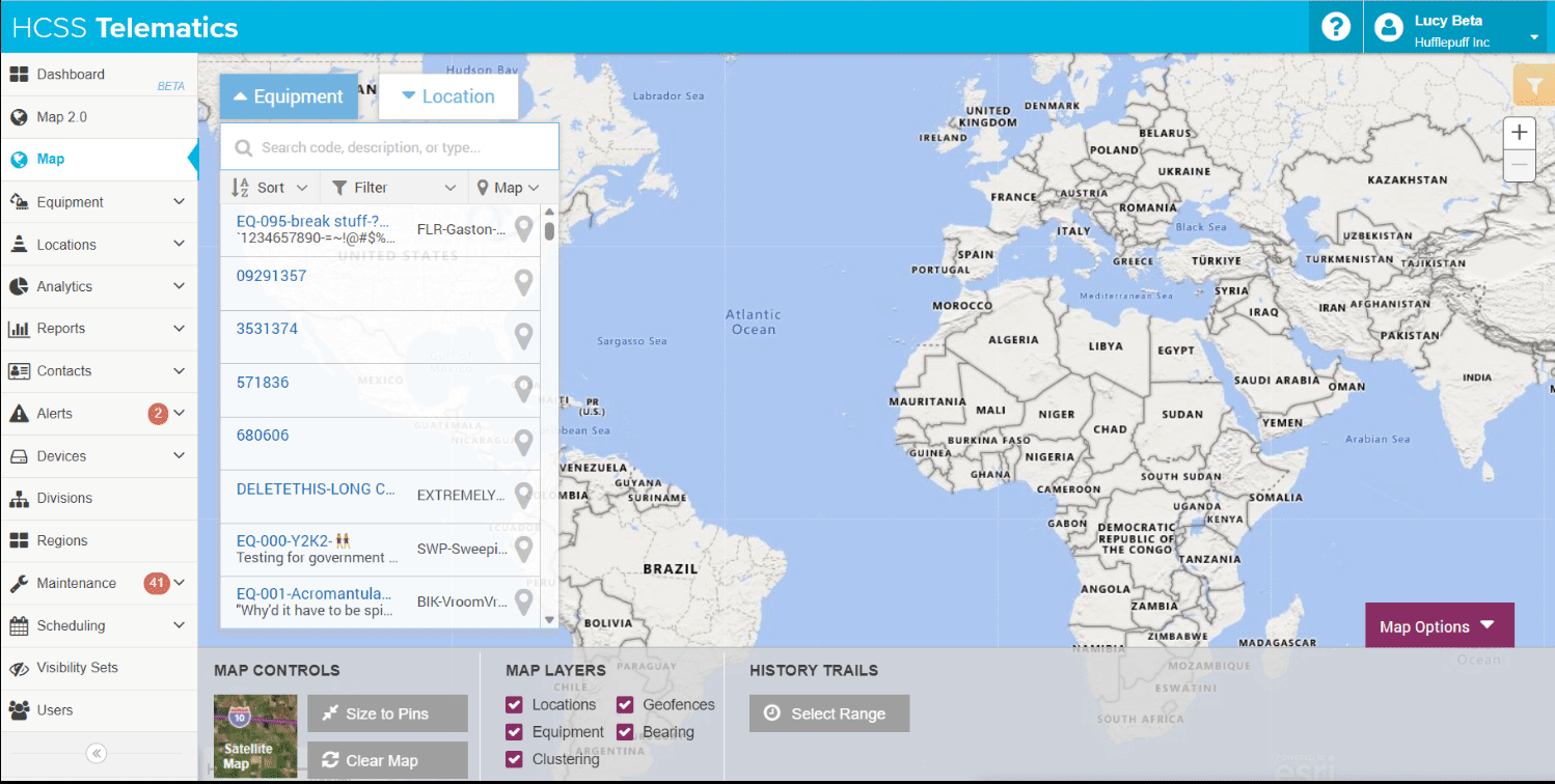
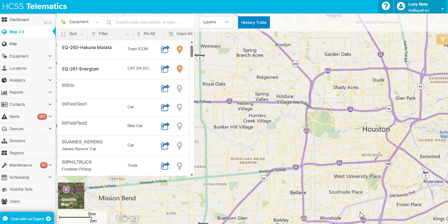
Current History Trails Features on Telematics

Initial Sketch
Initial Mid Fidelity Wireframes

Another Mid Fidelity Wireframes
The mid-fidelity wireframes consist of two main map pages accompanied by various dialogs, depending on the data users wish to access from the system:
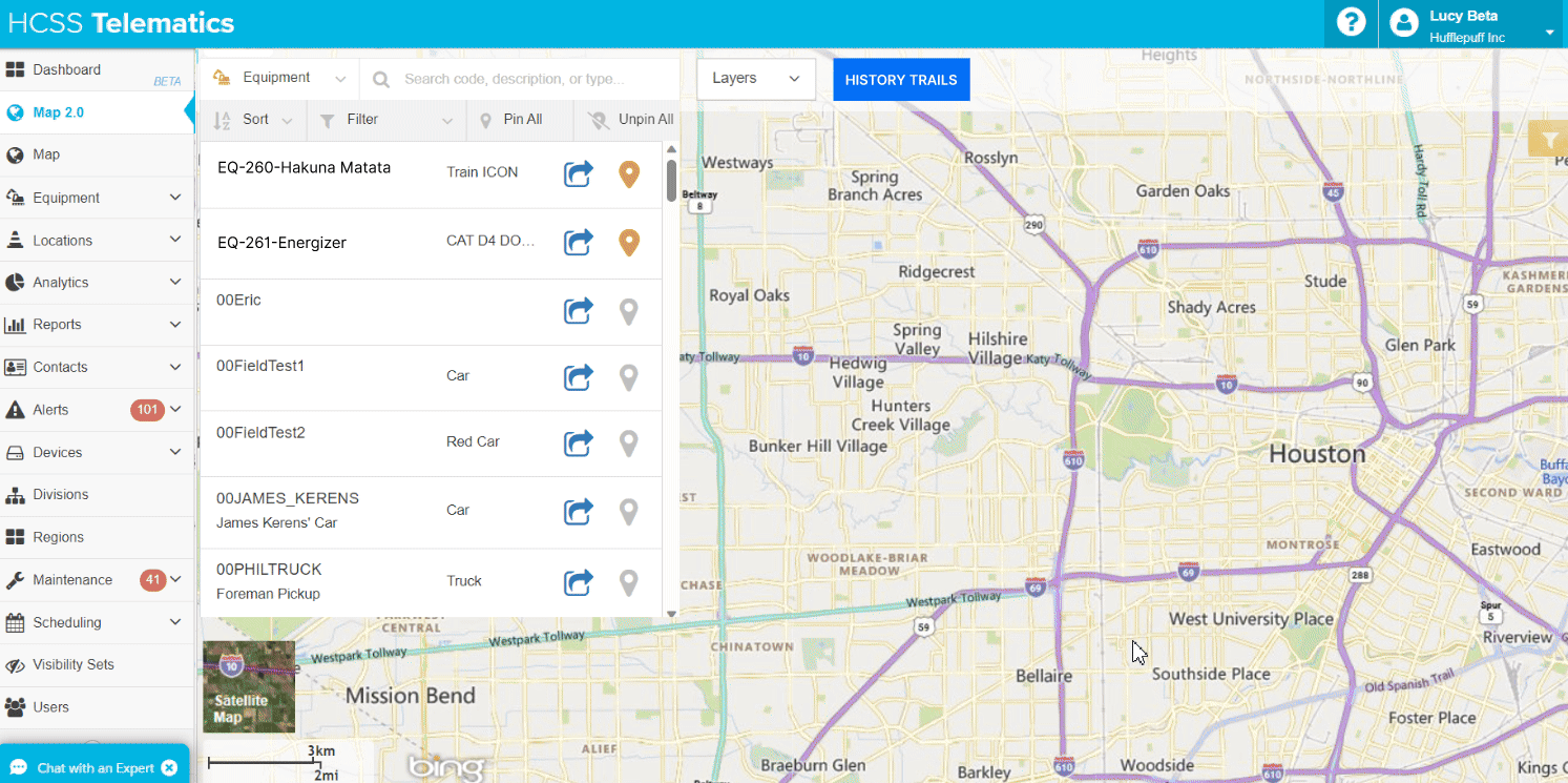
Main Map 2.0: This serves as the baseline map page. Dialogs pop up based on the categories users choose, such as equipment, location, or temporary location.
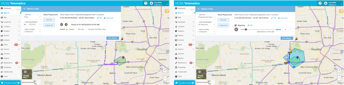
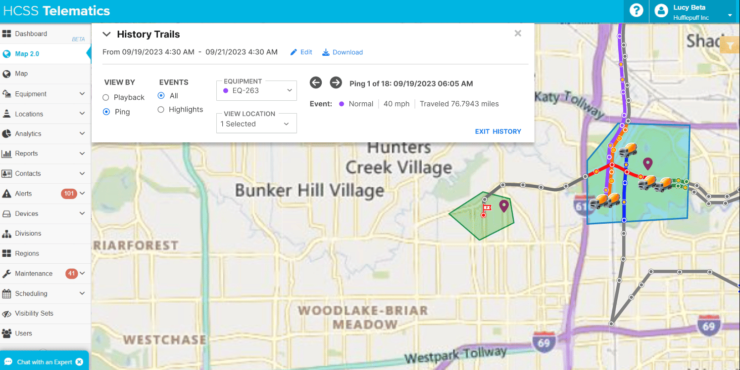
History Trails Result Map: This displays the result of the data pulled based on the user's selection. The map is interactive, allowing users to access detailed information based on selected pings, locations, or equipment.
Dialog 1: This dialog includes options to specify the date and time range, as well as select equipment, location, or temporary location to populate the data.
Dialog 2: This dialog presents the result of the populated data, which can be shown as pings or playback. It is interactive and adaptable to the selected point on the map chosen by the user (ping of equipment and location details).
Style Tile
After discussions midway through the project, we decided to transition from Bootstrap to React, integrating the new Design System, HCSS UI. While retaining Telematics' theme colors, this transition will give the overall look a more simple, sleek, and modern appearance. Furthermore, the interactions will be enhanced to be more sleek and functional, aligning with the new design system.

” I initiated the design of the prototype in Figma with detailed interactions to ensure a comprehensive representation. Subsequently, I presented these prototypes to stakeholders and the UX team, seeking feedback to refine and improve the design further.”
4. PROTOTYPE & VALIDATION
Responsive Prototype

I created a prototype with three workflows as discussed earlier with detailed interaction:
Equipment flow: This is the original workflow from the current version: users select one or more pieces of equipment and specify a time range to run the feature. The updated version enhances this workflow with a new, interactive UI, providing a more modern and user-friendly experience.
2. Location flow : This option allows users to pull data based on selected locations or geofences. It will populate the data for every piece of equipment involved in those particular locations.
3. Temporary area flow : This option allows users to create temporary locations or geofences. It will populate the data for every piece of equipment involved in this area.
Design Review with Stakeholders and Peer Review Summary
Once I completed the prototype, I arranged a Design Review with stakeholders (Product Manager, Technical Product Manager, and Dev Manager) and a Peer Review with the UX Team. I presented the prototype, articulating the story, interactions, and my solutions.
Goals for Design and Peer Reviews:
Evaluate the details of the workflows to ensure they are logical for users and identify any necessary changes or improvements.
Understand potential user pain points during tasks.
Gather feedback on the overall design and interactions to enhance the user experience of the History Trails feature.
Validation Interview
The goals for the validation interview are similar to those from the internal reviews. However, the key difference is to understand and receive direct feedback based on the use cases our customers face daily when utilizing this feature. Additionally, it aims to validate the solutions created based on the initial feedback from the discovery interview. This interview was conducted via Google Meet with two participants: a Fleet Manager from H&K Construction and a Logistic Analyst from Earle Construction. Check some of the findings below:

Priority Revisions
After gathering feedback and understanding the pain points from stakeholders, UX team members, and customers, I made several necessary changes to the prototype. There are more detail changes but below are some of them:

Map 2.0 Screen
Problem: The modal is still using Bootstrap style, and stakeholders and the UX team decided to implement the new HCSS UI design system.
Solution: Update the modal to use HCSS UI.Problem: The "view by" option is not visible, making it harder to change the view without extra clicks.
Solution: Change the structure and component to radio buttons for better visibility and efficiency.Problem: Ping events appear like clickable buttons instead of chips, which can be unclear for users.
Solution: Change the structure and component to radio buttons for clarity and consistency with the "view by" component.Problem: The dialog takes up too much space on the map, reducing efficiency.
Solution: Allow users to move the dialog around on the map for more flexible use.

Map 2.0 Screen
Problem: The modal in hide mode retains its Bootstrap styling, and the length of the hidden dialog is awkwardly long, taking up unnecessary space.
Solution: Implement HCSS UI components for the modal and optimize the hidden size to be more compact, saving space.

Form Dialogue
Problem: The instructional text is unnecessary because the flow won’t continue if the user doesn’t meet the requirements.
Solution: Remove the text and communicate to the development team that users can proceed with the task only if requirements are met.Problem: When the user chooses to customize the time, the "custom" option should be automatically selected.
Solution: Add “custom” chip and automatically select it when the user chooses to customize the time.Problem: Since there are multiple steps for this workflow, it is clearer to number them for clarity and limit the options to focus on selecting equipment, location, or drawing a location.
Solution: Add numbers to the steps for clarity and design a clear UI with informational text for users to select from the options to run the task.
The Final Product
The new prototype with the priority revisions can be checked here.
5. REFLECTIONS
What I learned & Challenges
Coming from different domain: Designing a feature for the construction industry proved to be complex and challenging, especially coming from a different industry and starting from scratch. In the beginning, the learning curve felt overwhelming, but I persevered by consistently seeking input from others about the project, its logic, and its details. While daunting, my persistence paid off, and over time, things began to improve. Armed with knowledge and information, I ultimately delivered the best possible outcome that satisfied our customers.
The importance of feedback: Throughout the process, I learned the importance of seeking feedback and conducting thorough reviews with stakeholders and peers. These sessions often revealed details I had overlooked, whether from a logical, UI, or interaction perspective. While criticism at times felt harsh, I remained focused on achieving the best results for the user, reminding myself that feedback isn't personal – everyone aims for excellence in their work.
Alignment & collaboration: Collaborating with experts from diverse backgrounds enriched the project, but also presented challenges in aligning perspectives and communication. I discovered the importance of active listening to gain insights from others, while also not hesitating to ask clarifying questions to ensure mutual understanding. Alignment meetings proved invaluable in reining in broad discussions and refocusing efforts in a unified direction.
Continuous learning: through UX podcasts and participation in UX gatherings, proved immensely helpful. These opportunities not only expanded my knowledge but also allowed me to share experiences with professionals from various companies. Understanding different problem-solving approaches has been enlightening and has enriched my own approach to design.

Next Steps.
For this History Trails Feature project, we will divide by 3 phases in sprints because it is quite a big project.
The next step will be:
Hand off the project to the dev team through a walkthrough meeting for planning.
Stay involved in the development process to offer input and resolve any doubts.
Conduct pair testing with the dev team before each public launch to ensure alignment.
Share a survey with customers post-launch to gather feedback.
Use collected feedback to iteratively improve the feature in future updates.